How Healthcare Organizations Can Boost Digital Discoverability

When health systems are struggling with low volume, leaders are often quick to suggest ad campaigns. But when your website doesn’t serve as a welcoming digital front door for patients, ads only go so far. Instead, you may need to invest in digital discoverability. By building a more robust website, highlighting provider reviews, and offering a mobile-optimized experience, you can boost patient engagement.
Even conservative industries like banking and real estate now offer seamless digital experiences for their customers. And yet, healthcare still largely lags behind. That hasn’t changed patients expectations, however. They want to choose a healthcare provider with the same ease and convenience that they shop online. And if your health system can’t offer that experience, patients won’t hesitate to choose one that does.
But what exactly can you do to get your website up to snuff? Here are a few of our top tips.
Answer All of the Basics
Many healthcare organizations bury (or even fail to include) the information potential patients want most. To avoid doing so, try thinking in terms of your patients’ key questions:
- What: List the most common services in plain language (e.g. “knee replacement” instead of “knee arthroplasty”)
- Who: List the providers, their bios, and their availability
- Where: List your address and directions (including from public transit)
- When: List your hours of operation
- How: Describe how patients can reach out to you and access care, whether that’s through a phone line, email, telehealth appointment, in-person appointments, etc.
- Why: Share reasons why patients should choose you — highlight awards, your culture, etc.
If you want to go the extra mile, you can also consider including:
- Different versions of the site in each of the major languages used by your patient population
- An FAQ section (which has the added benefit of boosting your SEO rankings)
- Video content
- An easy-to-navigate list of services and prices (not just a busy Excel sheet buried deep within your website)
Read More: 5 Key Pillars of Digital Patient Engagement — & How They Improve Access to Care
Leverage Chatbots
You may not have the staff to provide each of your website visitors with one-on-one attention, but with the help of chatbots, you can offer the next best thing. Chatbots are a particularly good alternative to call centers, where team members are often overworked and wait times are long — leaving patients looking for a better solution.
A few different use cases for chatbots include:
- Answering FAQs that call center workers often receive
- Interactive symptom checkers that direct patients toward the appropriate departments
- Appointment scheduling
- Paying bills online
- Completing pre-appointment paperwork
Of course, chatbots shouldn’t be treated as a total replacement for call centers. While they can help reduce some inbound call volume, you’ll always have certain users who prefer or need to talk to live workers. Instead, think about chatbots as an omnichannel patient engagement opportunity — you can provide an option to escalate to a live representative or offer an interactive voice response so that call center reps can focus on more personal, urgent challenges.
It’s worth keeping in mind that using chatbots in healthcare requires extra privacy measures than many other industries — but given how far chatbot technology has come and the value it can provide to users, it’s well worth looking into.
Provide a Strong Search Function
A strong search function has become table stakes for online user experiences in just about every industry, but this critical part of digital discoverability is often overlooked in healthcare. Most health systems’ websites do offer at least a basic search function, but they’re rarely at the level that consumers have become accustomed to. Most website visitors coming to your site, however, are looking for a specific service — and providing them with that will boost patient engagement.
A few key components of a good search function:
- User-friendly with a simple interface
- Results displayed by relevance
- Typo tolerance — a search for “gynocology” will display the same results as “gynecology” would
- Synonym-friendly — a search for “eye doctor” will display results related to ophthalmology
- Ability to add filters, especially when searching for providers
- Results sorted out by category
Highlight Provider Reviews
With consumers turning to online reviews before making even minor decisions, like which flashlight to buy on Amazon or which restaurant to go to for dinner, it’s no surprise that they also want to consult them for decisions as important as choosing a medical provider. And while there’s no shortage of third-party sites that compile provider reviews, embedding them directly on your site boosts digital discoverability by giving prospective patients one less reason to leave it.
A lot of health systems hesitate to highlight any less-than-perfect provider reviews, but the truth is that prospective patients aren’t looking for perfect. In fact, people often trust reviews more when they aren’t as high as possible. A study by Northwestern University found that consumers were most likely to purchase products with ratings between 4.2 and 4.5 stars — anything above that was seen as too good to be true.
What’s more, sharing reviews on your own site helps establish credibility with potential patients. The willingness to be transparent, even about your imperfections, builds trust, and this trust brings loyalty — maybe even for life.
When incorporating provider reviews on your site, keep the following tips in mind:
- Display them prominently right within providers’ bios
- Make sure providers’ bios also contain info like their area(s) of specialty, languages spoken, insurance plans accepted, and education/training
- Photos are critical — when people can associate a provider’s name with a face, they’re more likely to book with them
Offer a Mobile-Optimized Experience
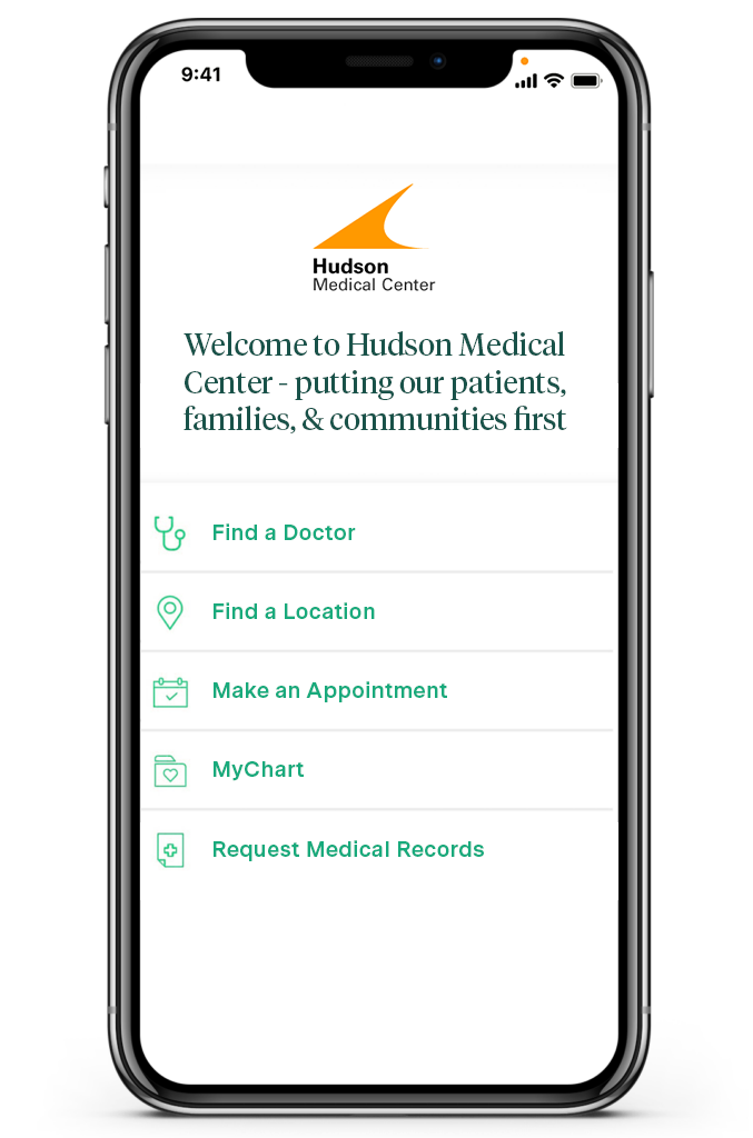
With 85% of Americans now owning smartphones — a trend pervasive across age, gender, race, and social class — it’s a mistake to assume that visitors are mainly viewing your website on a computer. In fact, if you aren’t sufficiently investing in mobile design, you may very well be ignoring the majority of your potential patients’ preferences — one Pew Charitable Trusts study found that 61% of Americans want to access healthcare information via mobile. Still, many health organizations fail to prioritize mobile-first design, which in turn harms their digital discoverability.
A few principles to stick to when optimizing your website for mobile:
- Keep it simple — choose clean designs with an uncluttered user interface
- Opt for collapsible menus and widgets
- Prioritize the most critical, high-level functionalities and data — granular info tends not to mesh well with mobile
- Have a prominent “Book Appointment” CTA whenever appropriate

Of course, the idea of redesigning or even just refreshing a website can seem intimidating. And if you’re anything like most healthcare organizations, you’re already strapped for bandwidth and resources. But even small changes can make a big difference when it comes to digital discoverability and patient engagement. And the sooner you get started, the more of an edge you’ll have on the competition.
Tap Here to Learn about Q Reach


